Clair Skincare Mobile Application
Mobile skincare routine application that makes skincare accessible to beginners by simplify the process and resources.
Figma
Fall 2021
Cloe: Skincare diary, product reviews, calendar overview
Charm: Skicare log, tracking, able to buy recommended products from the app directly
Curology: skincare subscription service, has access to virtual dermatologists.
A series of research interviews were conducted on a group of 10 individuals who
would be potential consumers of the app.
The targeted age group ranges from 18 to 30 years old,
with knowledge about skincare ranging from beginner to intermediate level.
Do you have a skincare routine?
How often do you use skincare (including sunscreen, face lotion, moisturizer)?
Do you do skincare both daytime and nighttime?
How many products do you use each time of the day?
How much time does it take you to do skincare?
Are you consistent with your routine?
Was it difficult for you to get into skincare?
What are some of the challenges that you’ve had when you first started?
Have you ever given up your routine? Why so?
Do you keep track of your process?
What are some resources that you have consulted before starting?
Difficult to start skincare because not sure where to start.
Unable to afford many product, and not willing to buy product when not sure if it would work.
Overwhelmed by the information available on the internet.
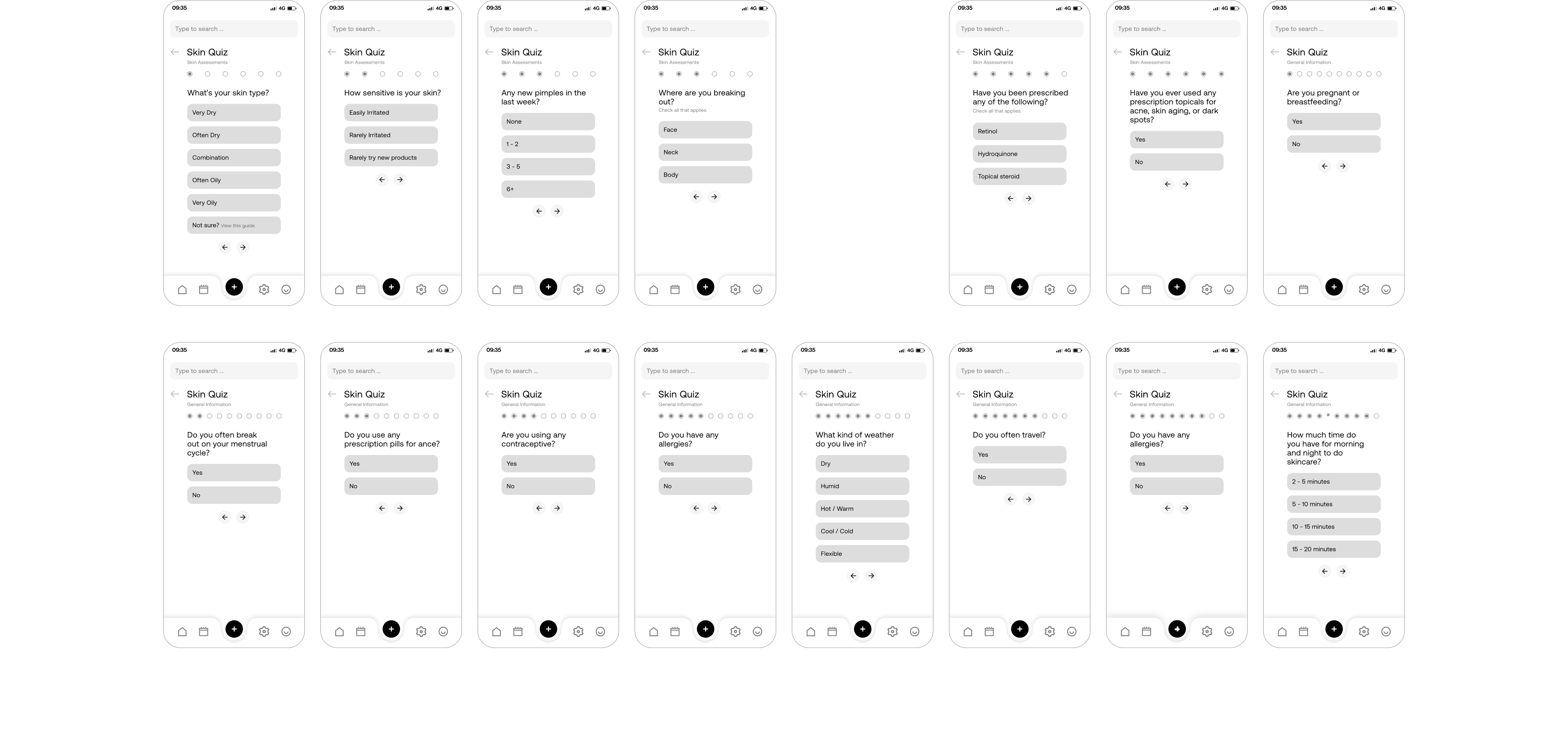
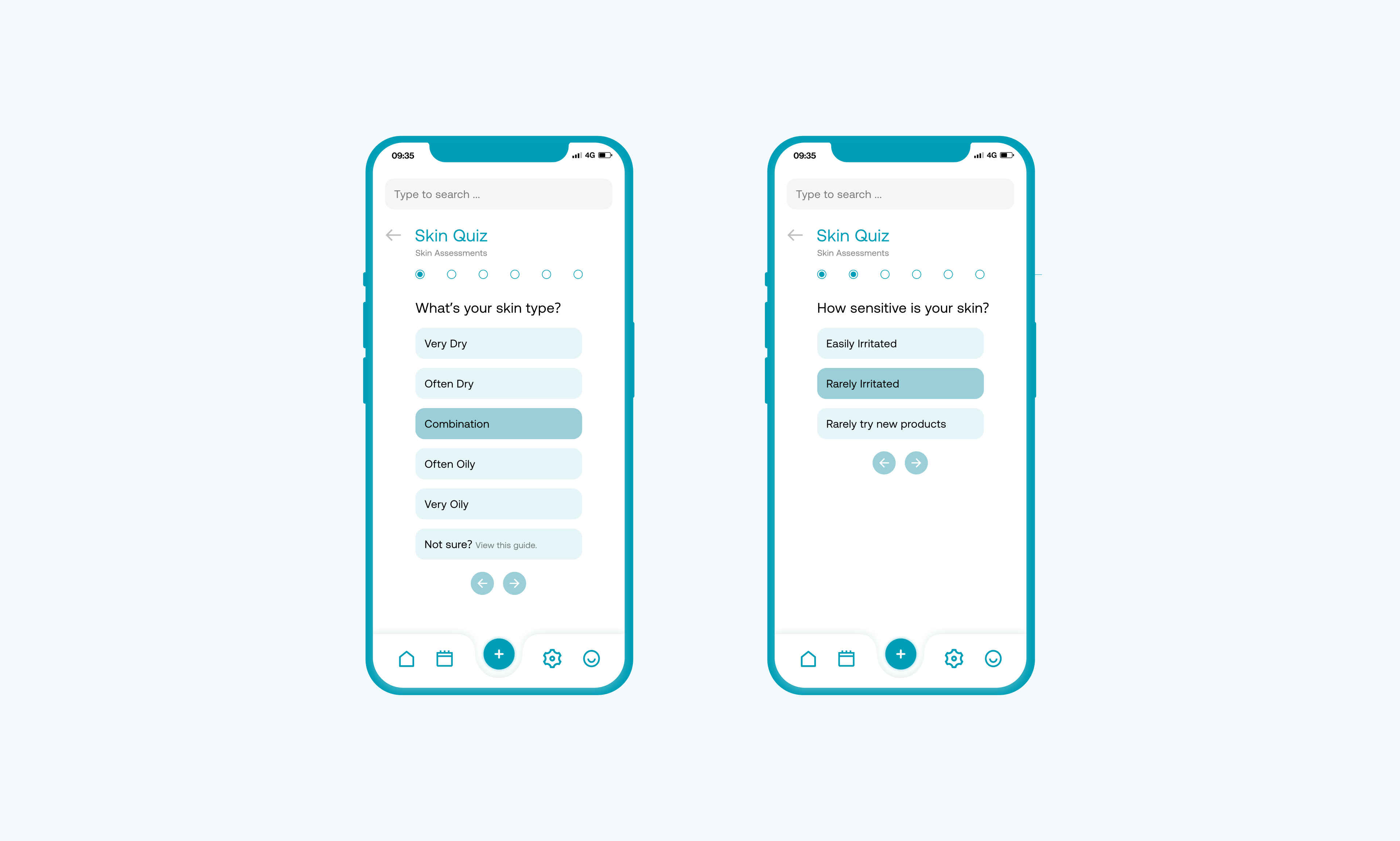
Unsure of skin type and what product would be appropriate for each skin type.
Not seeing progress.
A lot of breakouts and not sure what is the exact reason.
Lack of time and effort.
Forgetting to do the routine.
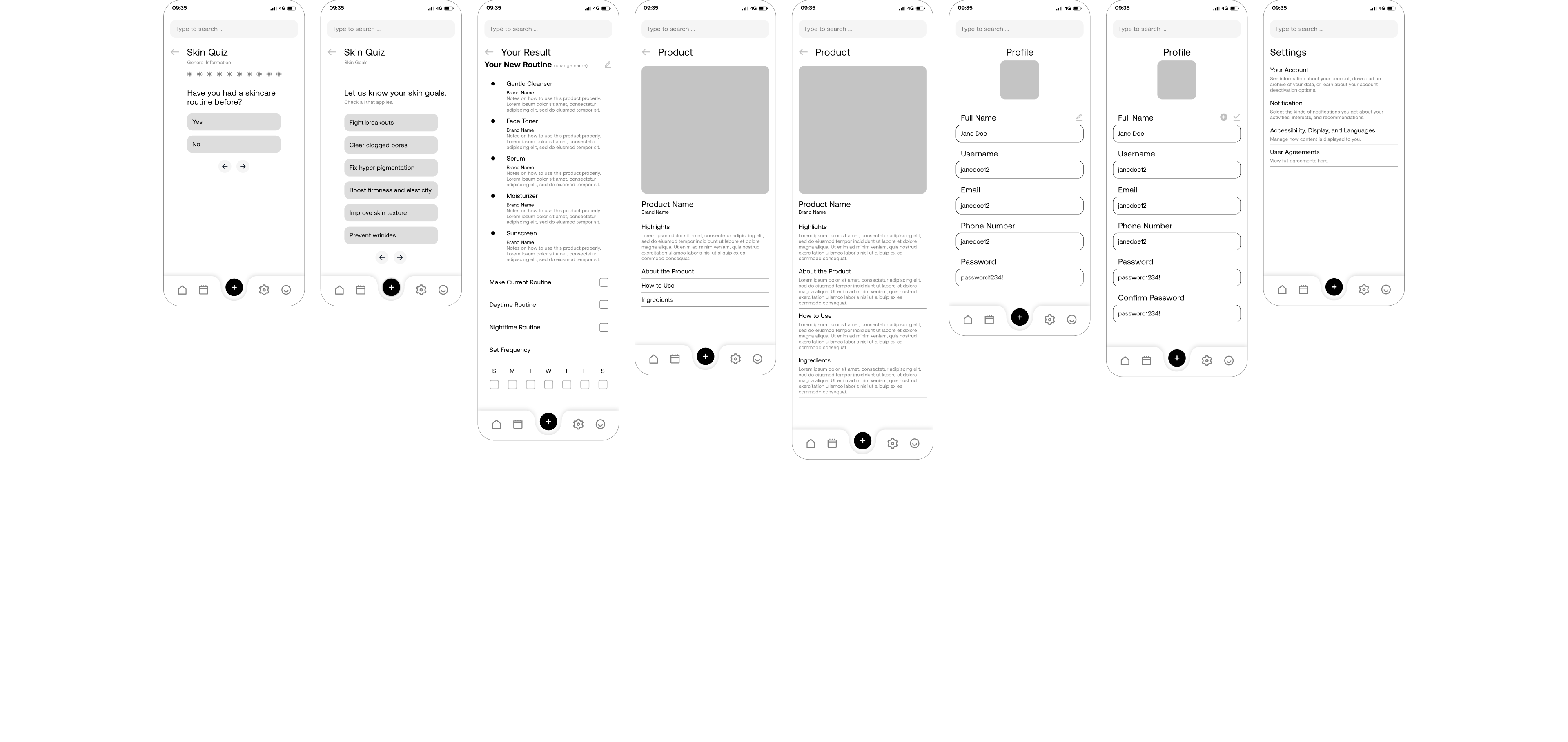
Many expressed that they would like some clear and
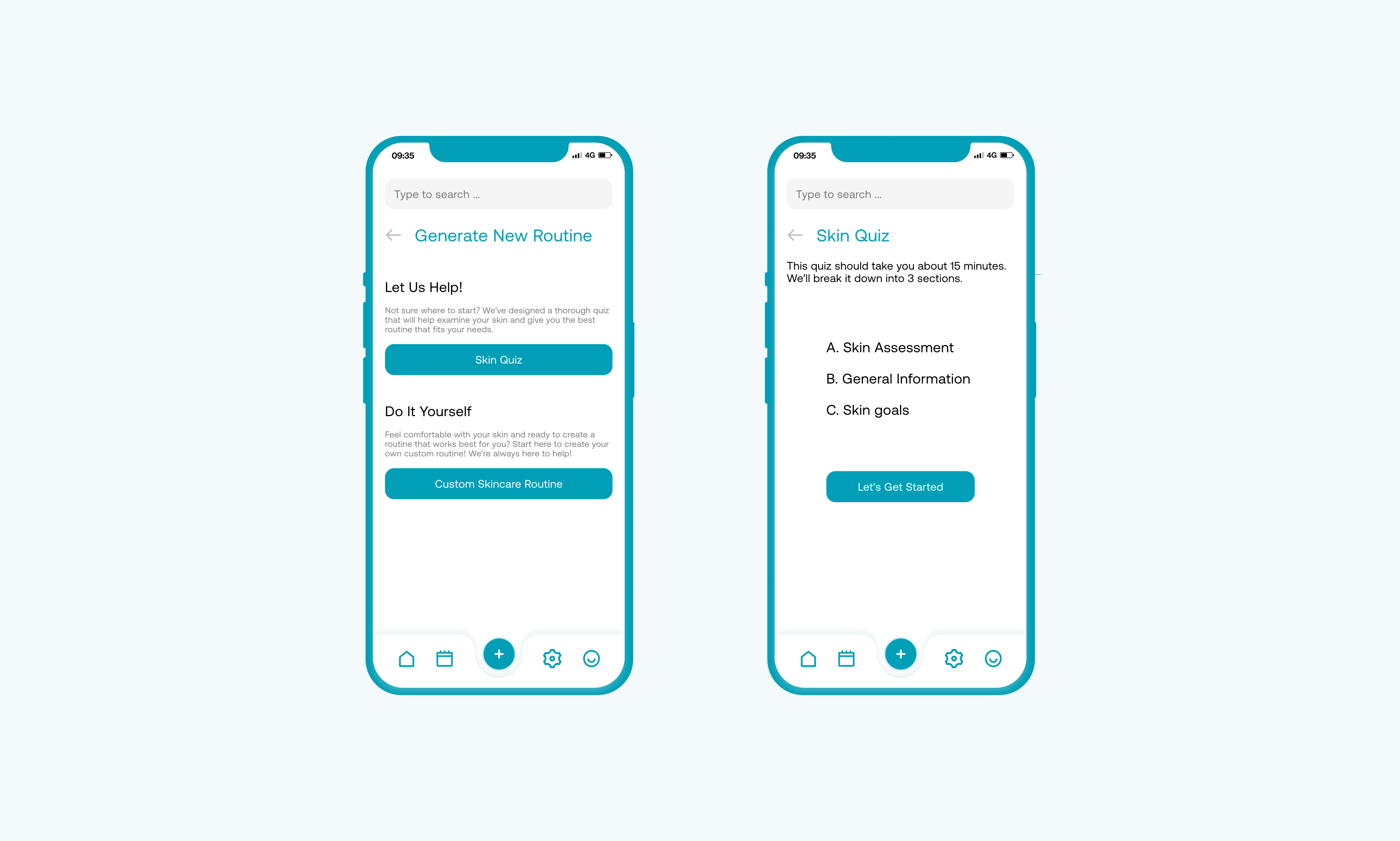
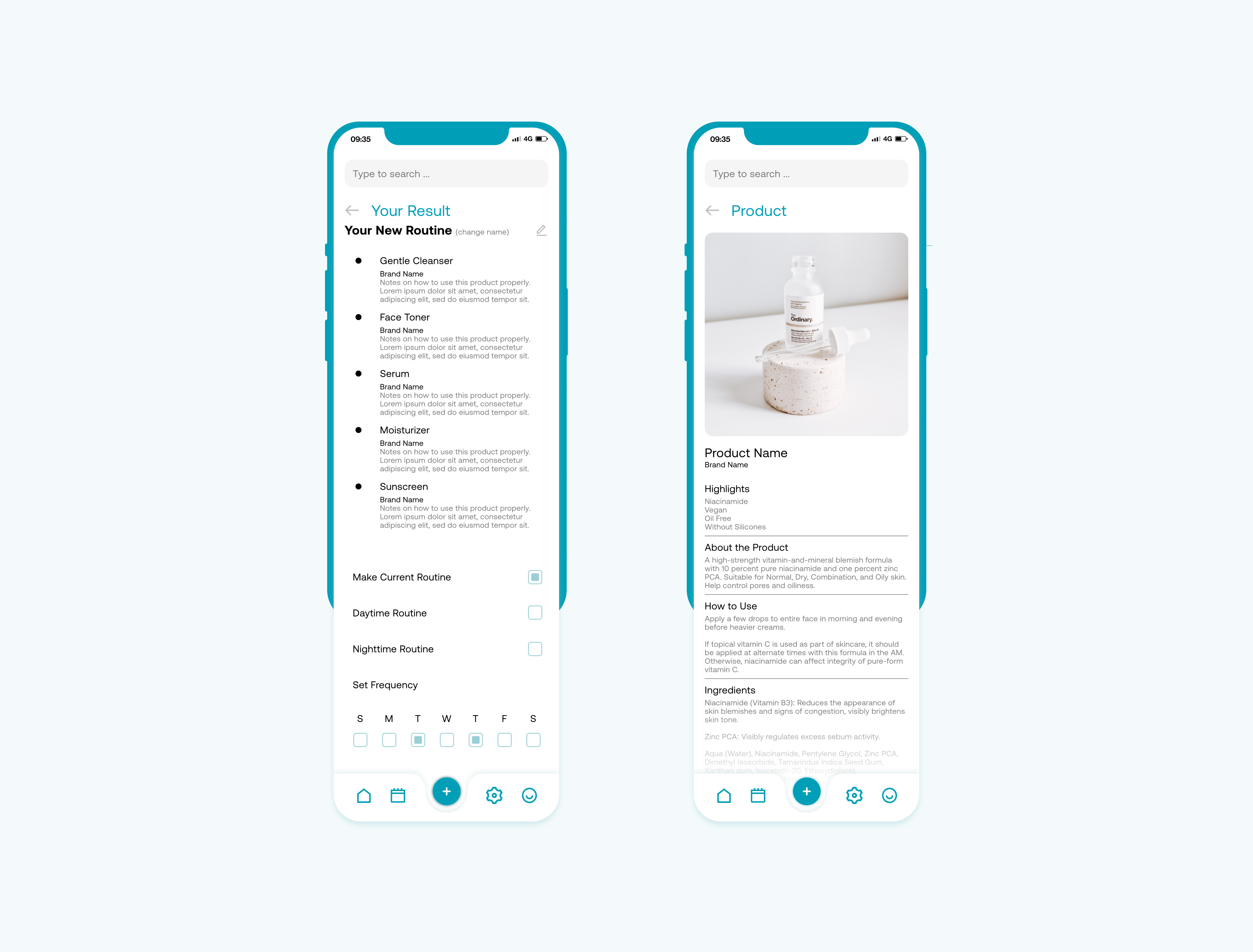
customized guidance, similar to a dermatologist.
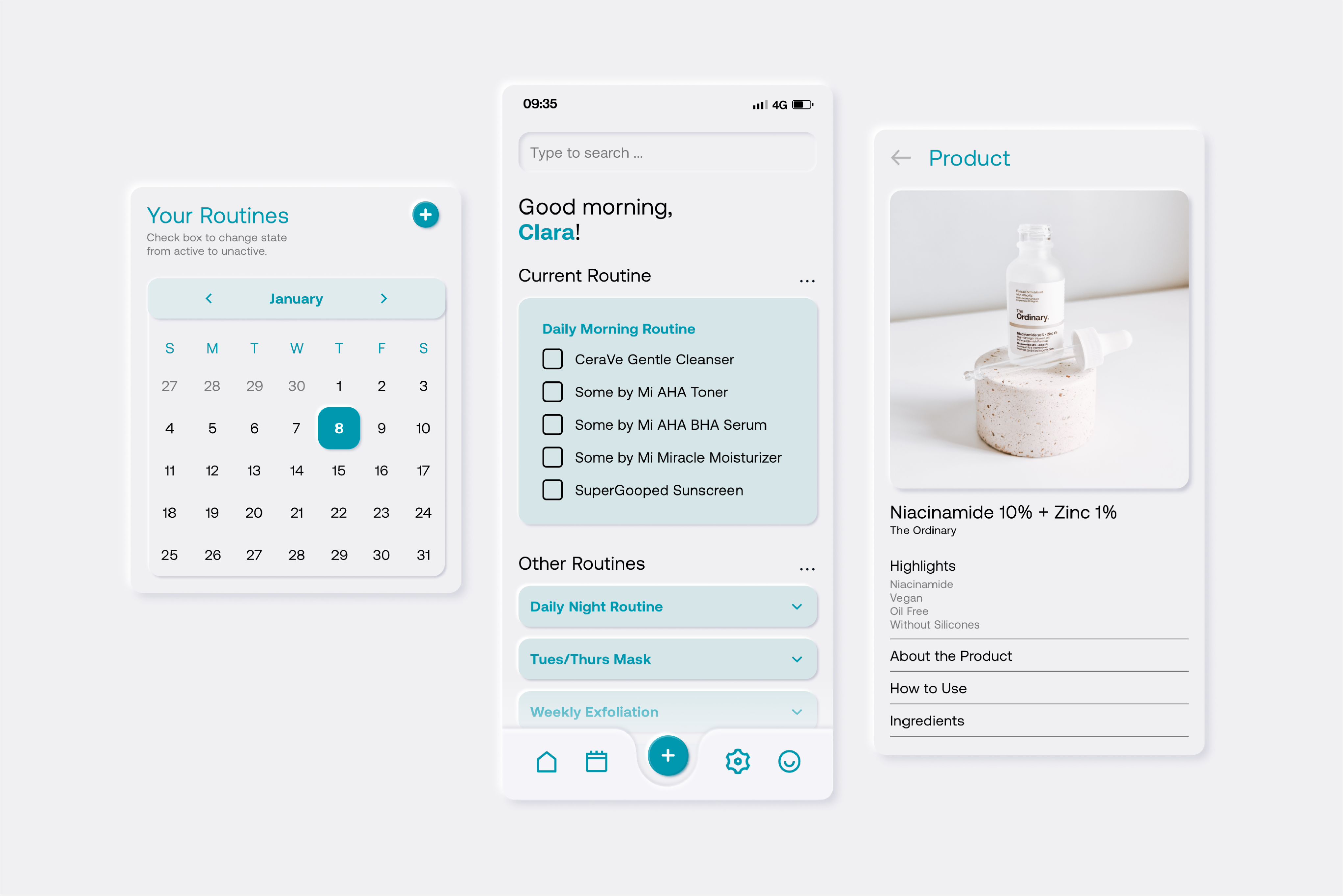
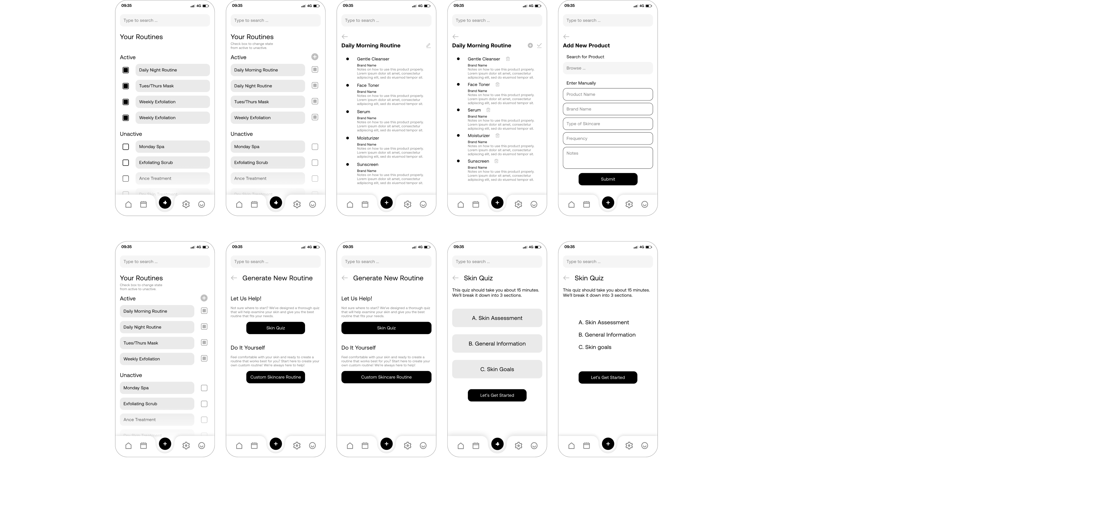
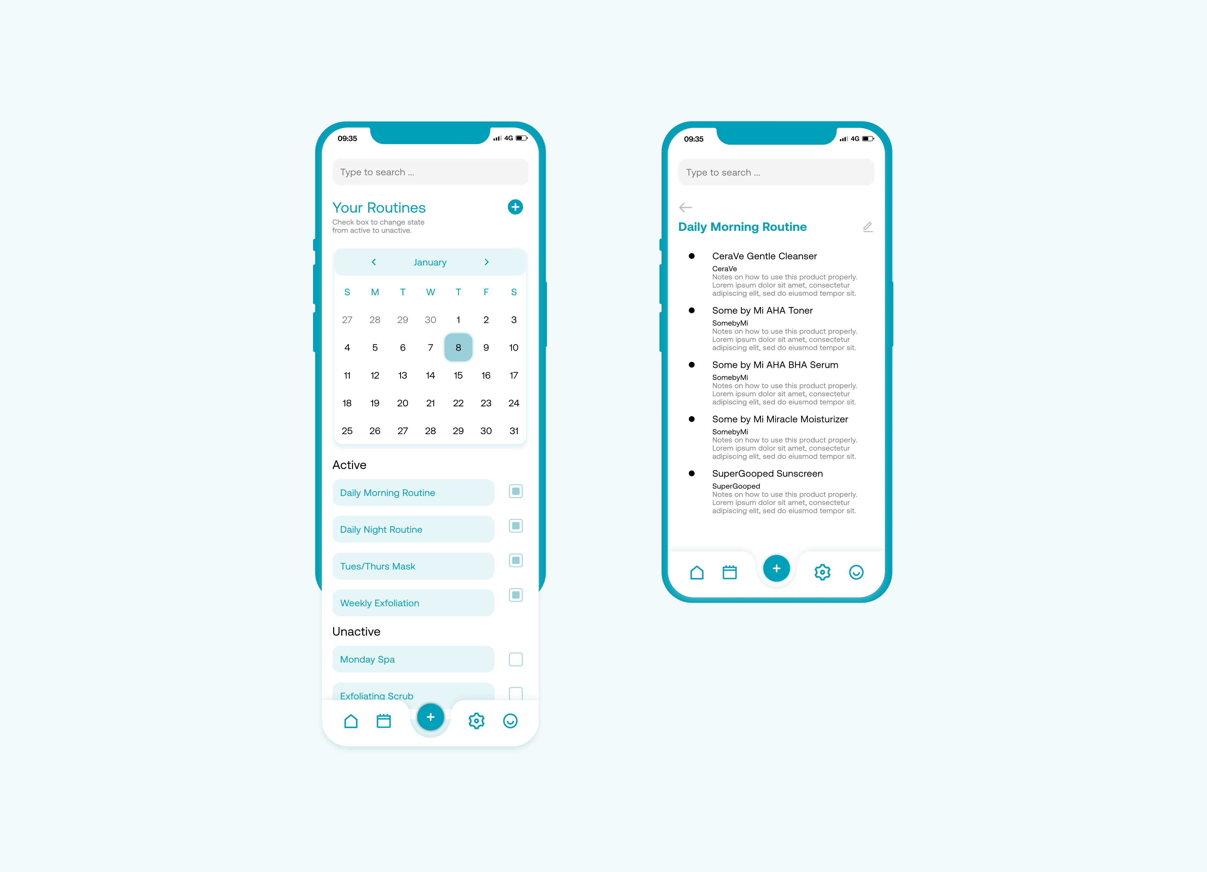
Easy process to add and edit the daily routine, allows for easy customizations.
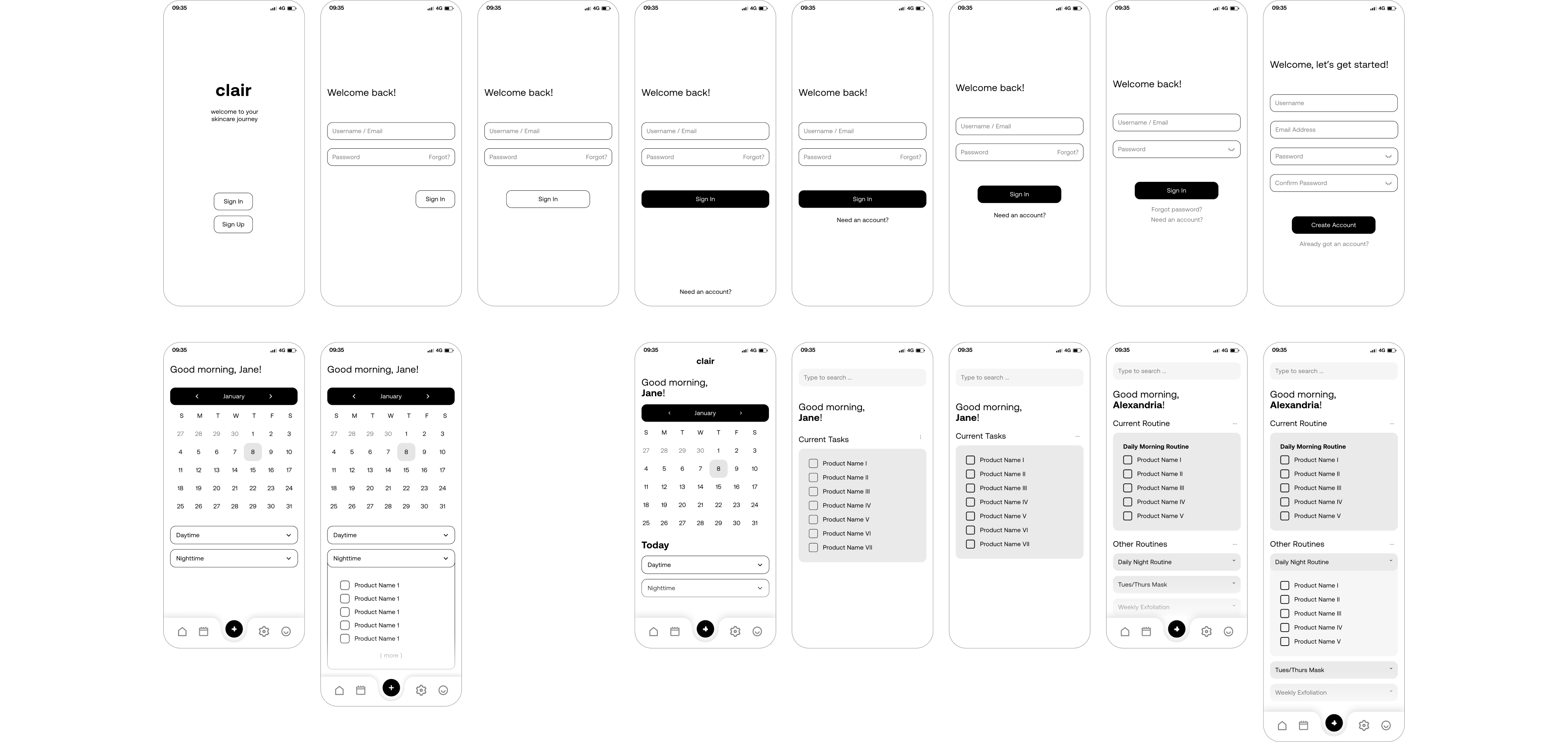
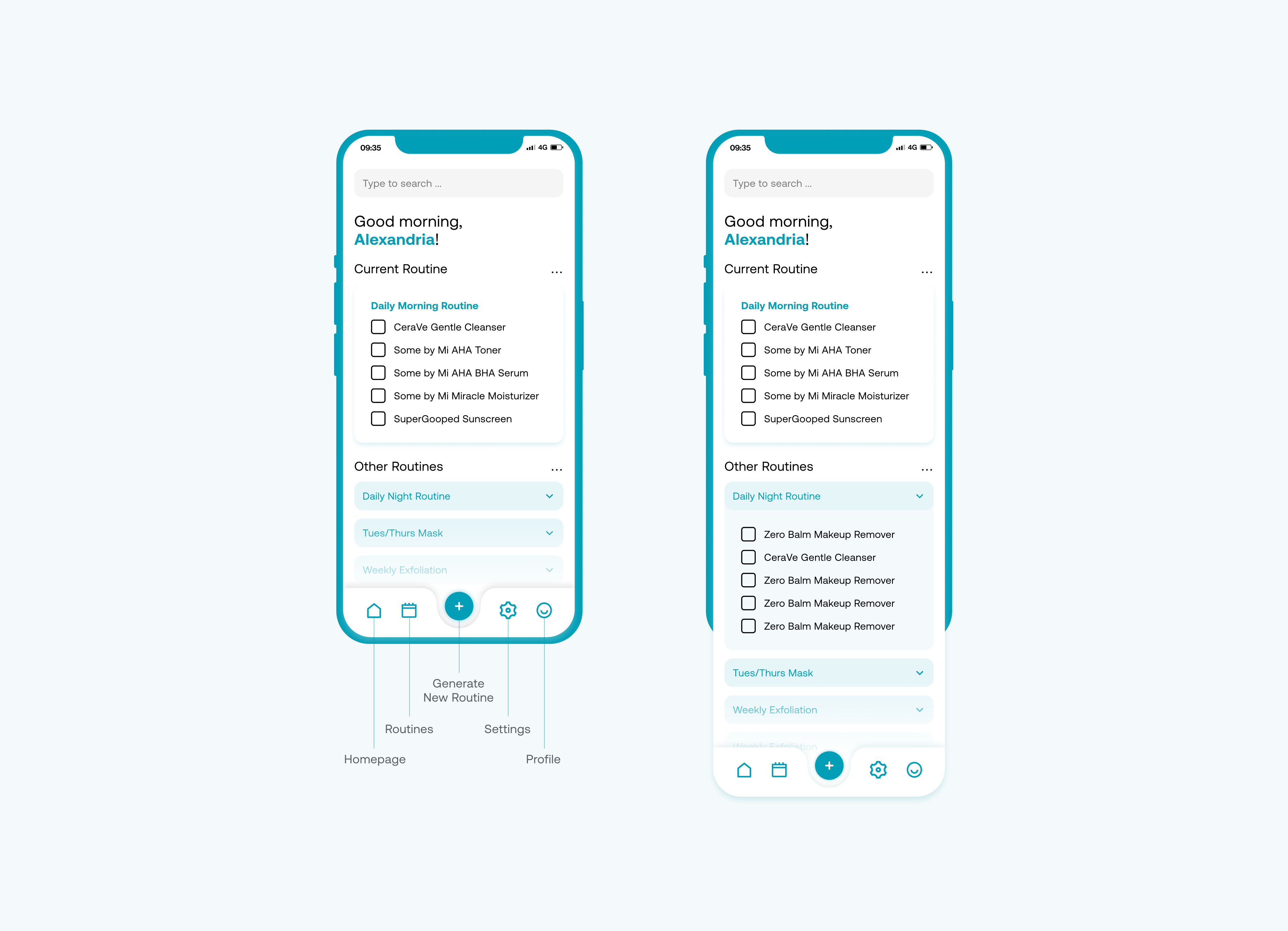
The icons and navigation system could be a bit more intuitive since users needed a bit of time to learn and memorize the system. Need to add a system to better identify which day the users are looking at when they are view past and present routines.
